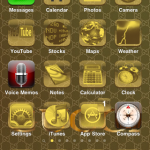
Last week I posted an article on Visual Continuity. I gave a good example and a bad example. Here is an example of Visual Continuity gone wrong. Where they used all the visual cues but then proceed to beat it to death.
It is a screen capture of my iPhone after installing the Gucci theme. In Gucci’s defense, it was probably NOT authorized by them. Visual continuity is there. Yes. But everything is washed out. On top of that, it is a phone! One should be able to glance at it and get to what they need – not strain their eyes to find simple actions.
Please send me examples of good and bad visual continuity.
One more thing. Why am I installing a Gucci theme on my iPhone? Don’t judge me.

